CLIENT:
Maria Angela Rodriguez
BRIEF:
For this project, the client wanted something different. She needed a brand identity for her psychotherapy practice that didn’t rely on typical medical blues or generic therapy symbols.
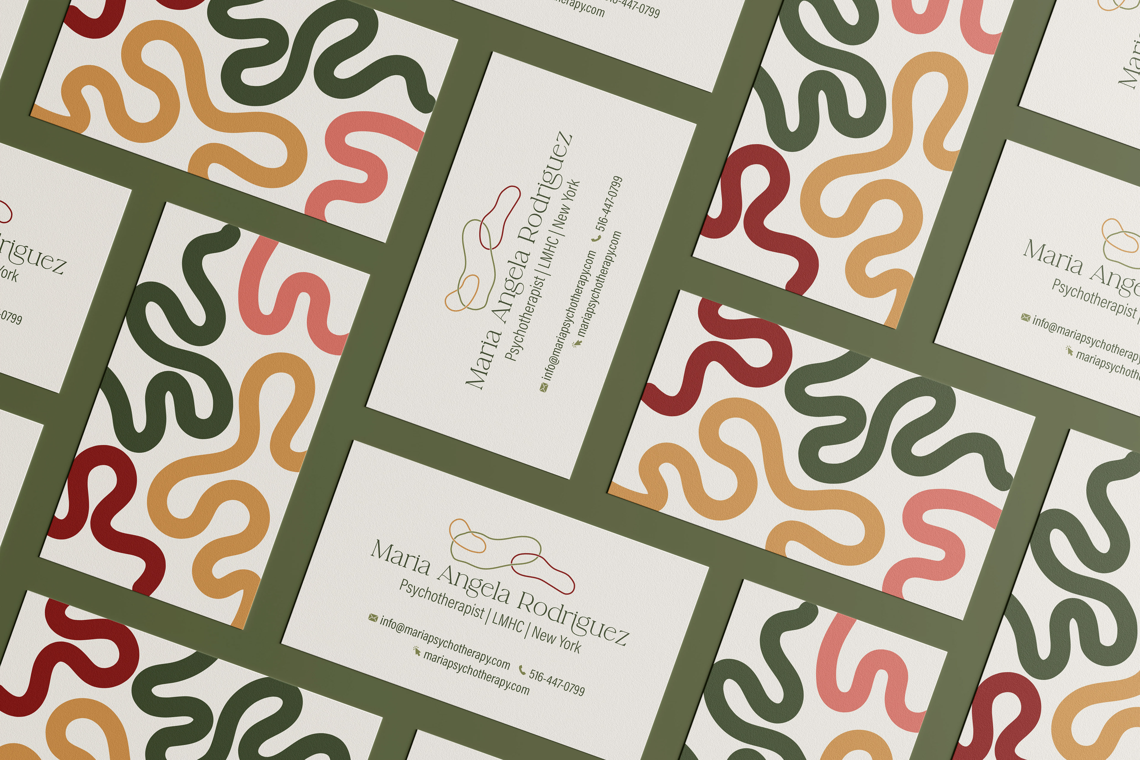
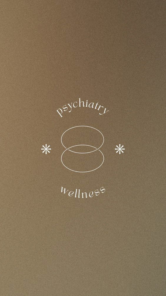
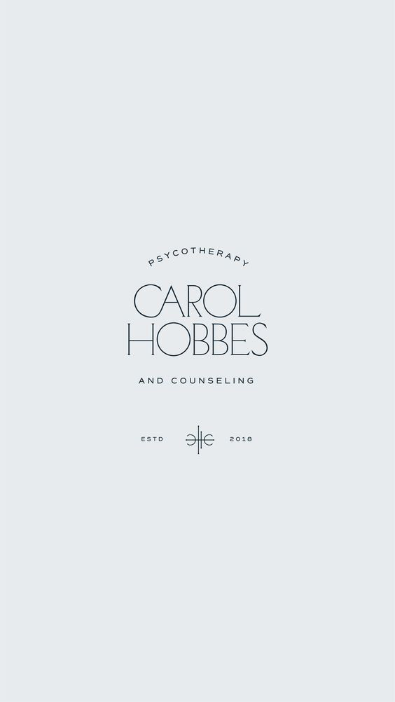
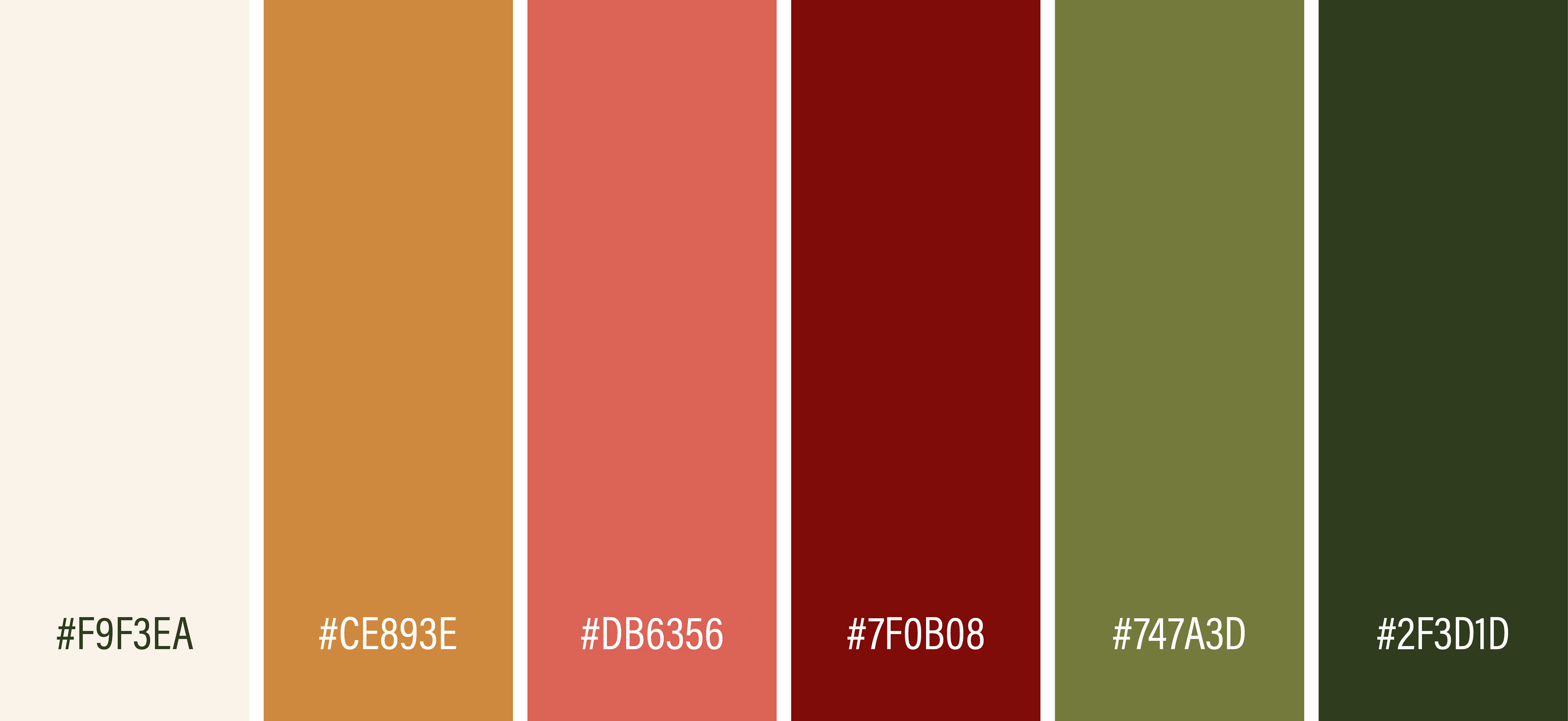
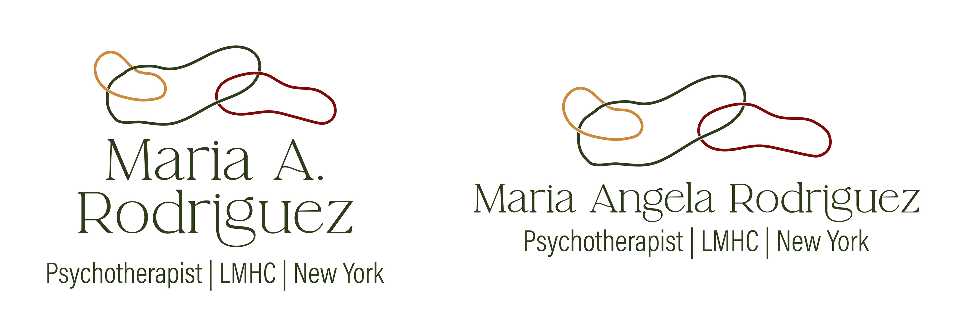
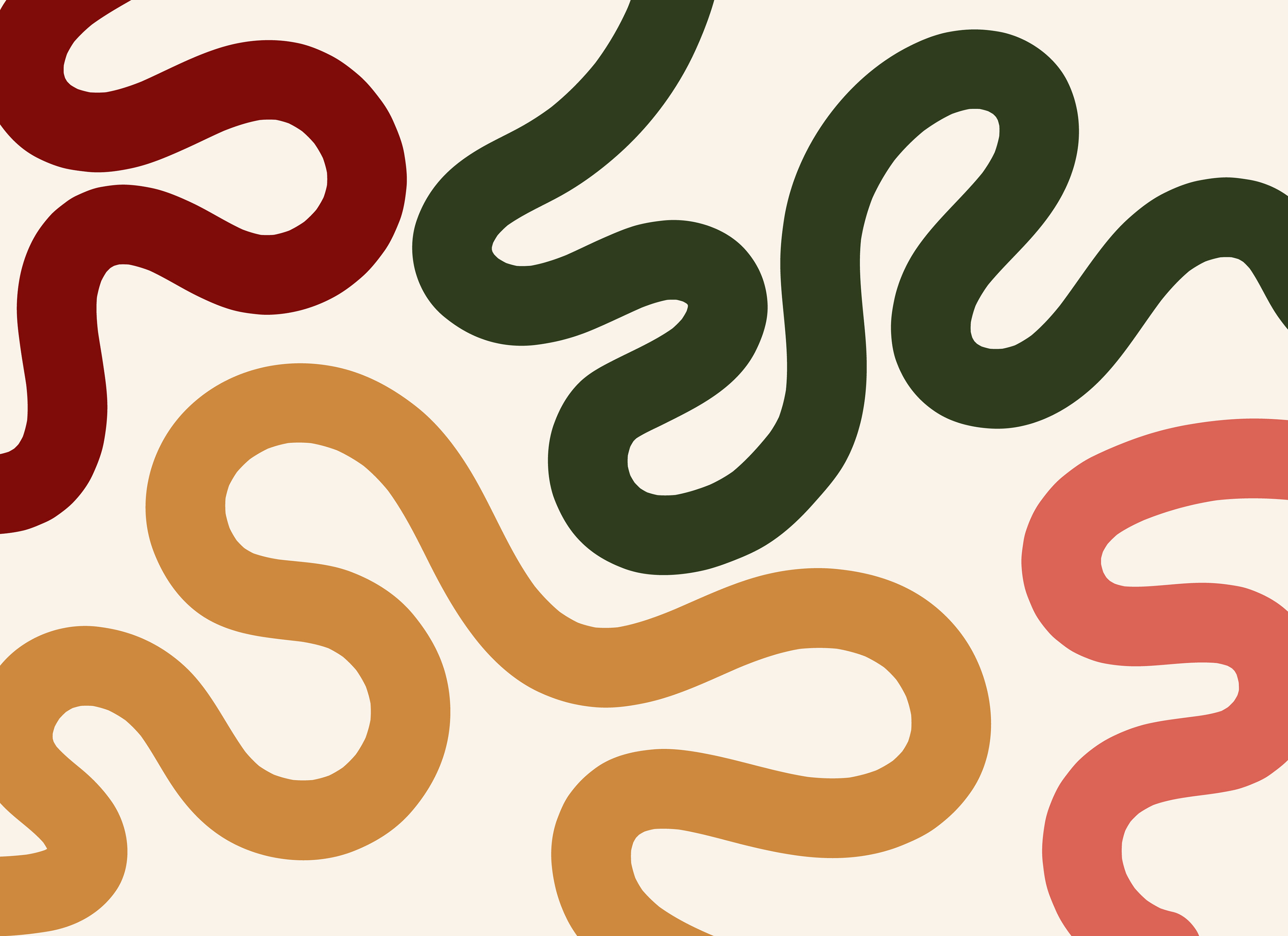
I chose earthy tones to communicate grounding and stability, reflecting the kind of support she offers as a therapist. The logo is made up of organic, interwoven hoops that represent how different aspects of ourselves are connected; it’s a continuous chain of the parts that shape who we are. The supporting pattern was inspired by the sulci of the brain, the wrinkle-like grooves that reflect depth and complexity.
I chose earthy tones to communicate grounding and stability, reflecting the kind of support she offers as a therapist. The logo is made up of organic, interwoven hoops that represent how different aspects of ourselves are connected; it’s a continuous chain of the parts that shape who we are. The supporting pattern was inspired by the sulci of the brain, the wrinkle-like grooves that reflect depth and complexity.
ROLE:
Lead designer from start to finish, this was a freelance client.
TIMING:
It took about a week, including feedback rounds.
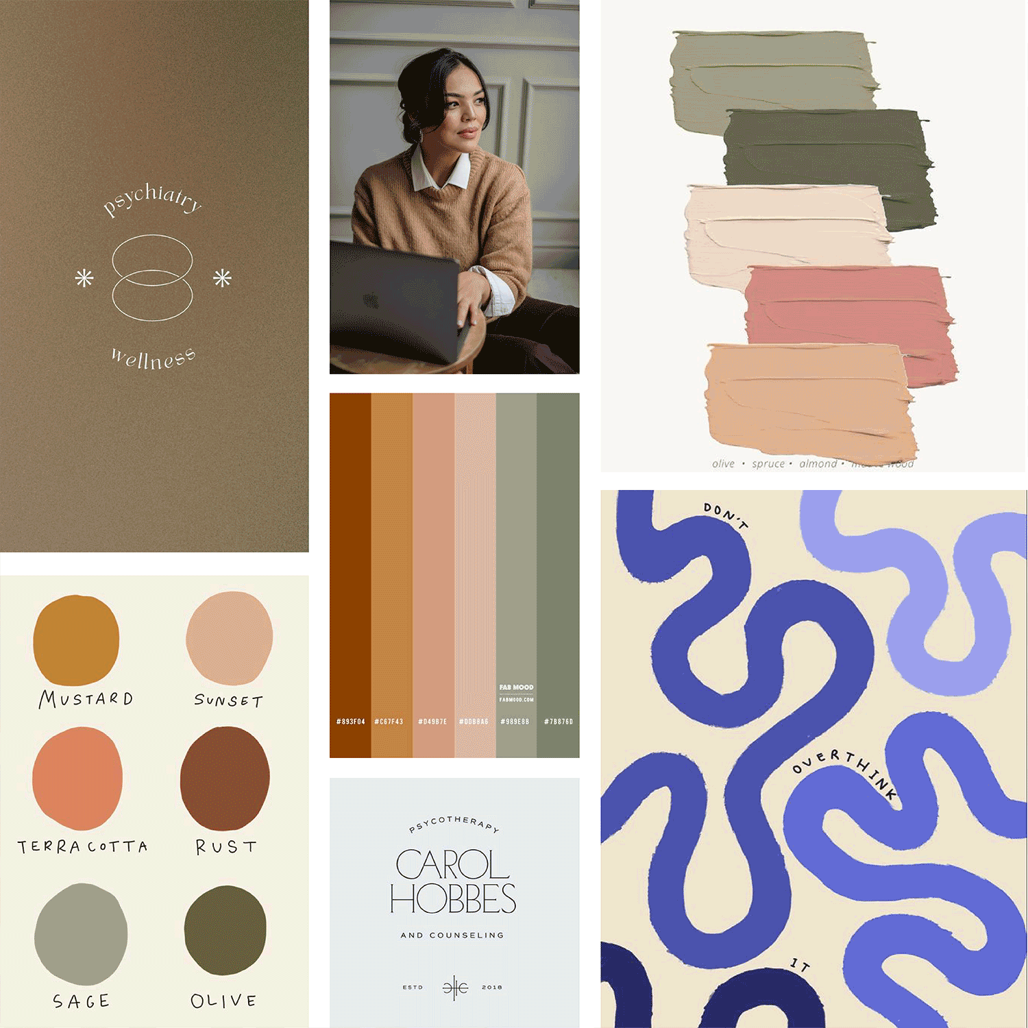
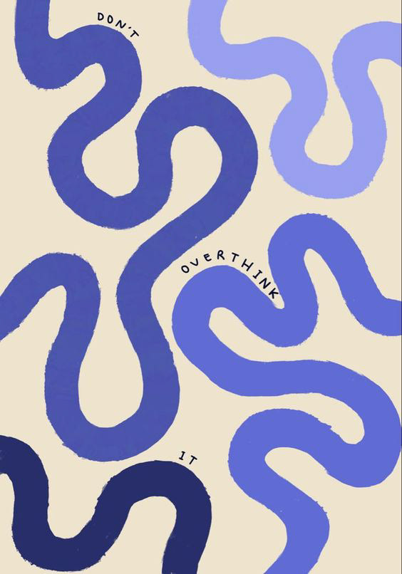
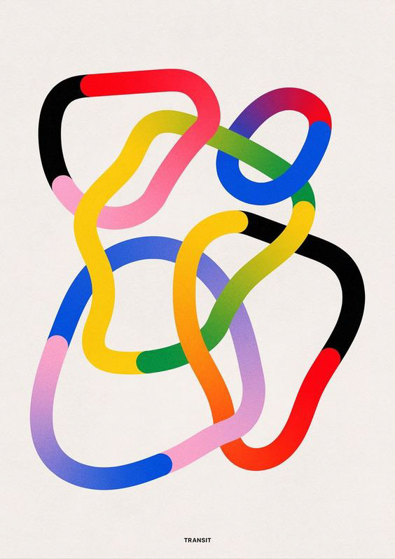
This was my mood board
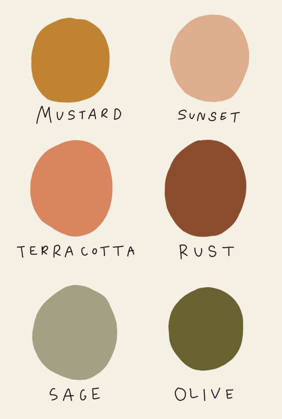

This is the color palette chosen between the client and me
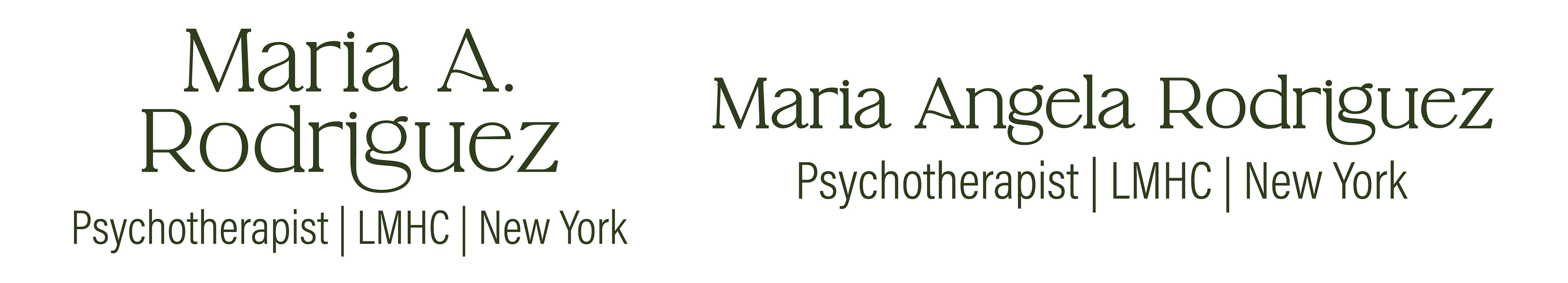
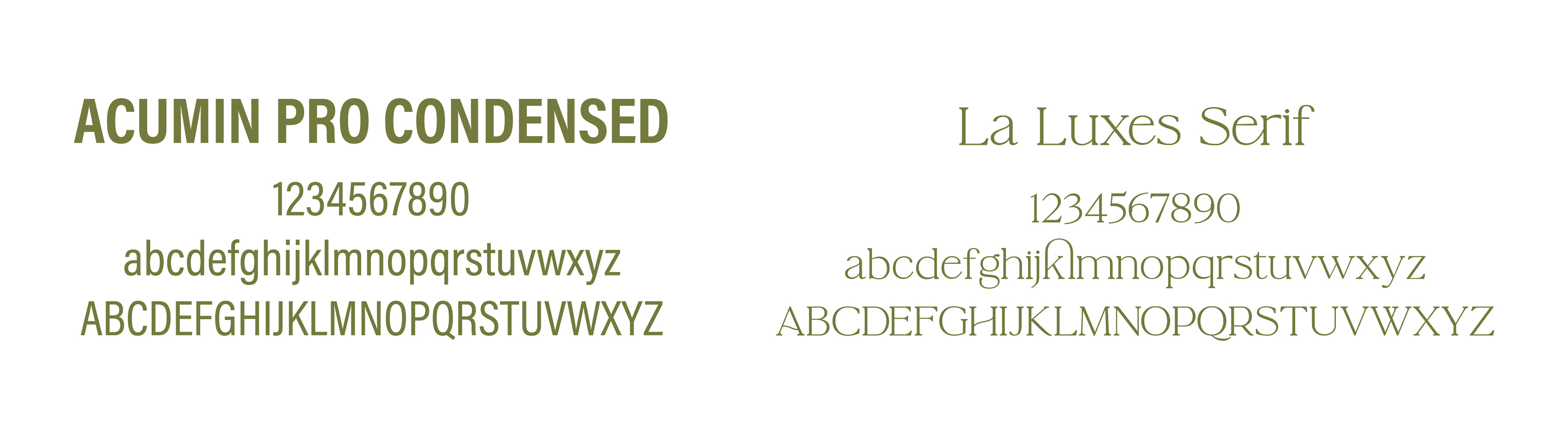
These are the wordmarks and the fonts I used
These are the final lockups
This is the pattern to add more color to the overall look and feel
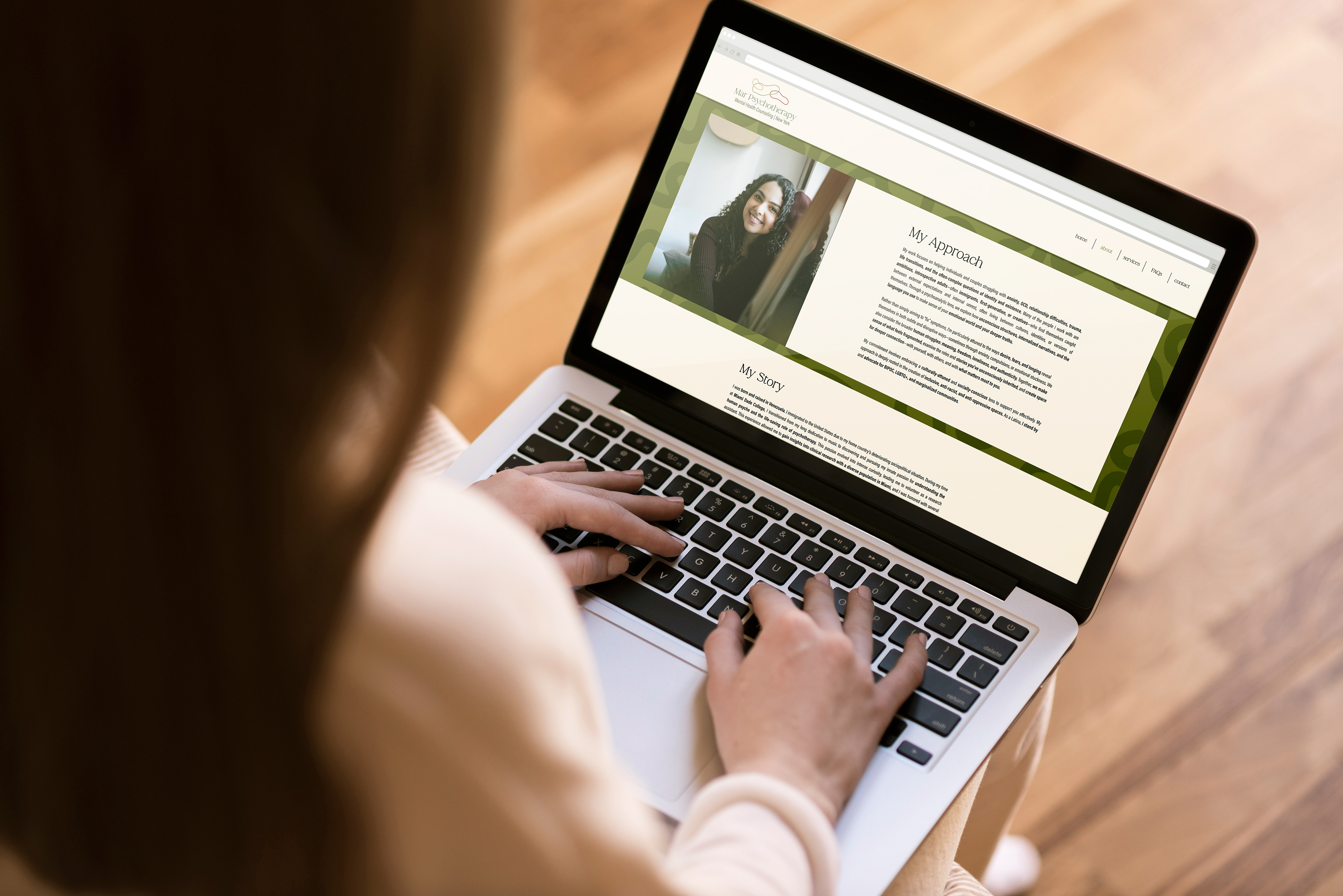
My favorite part, the business cards + website