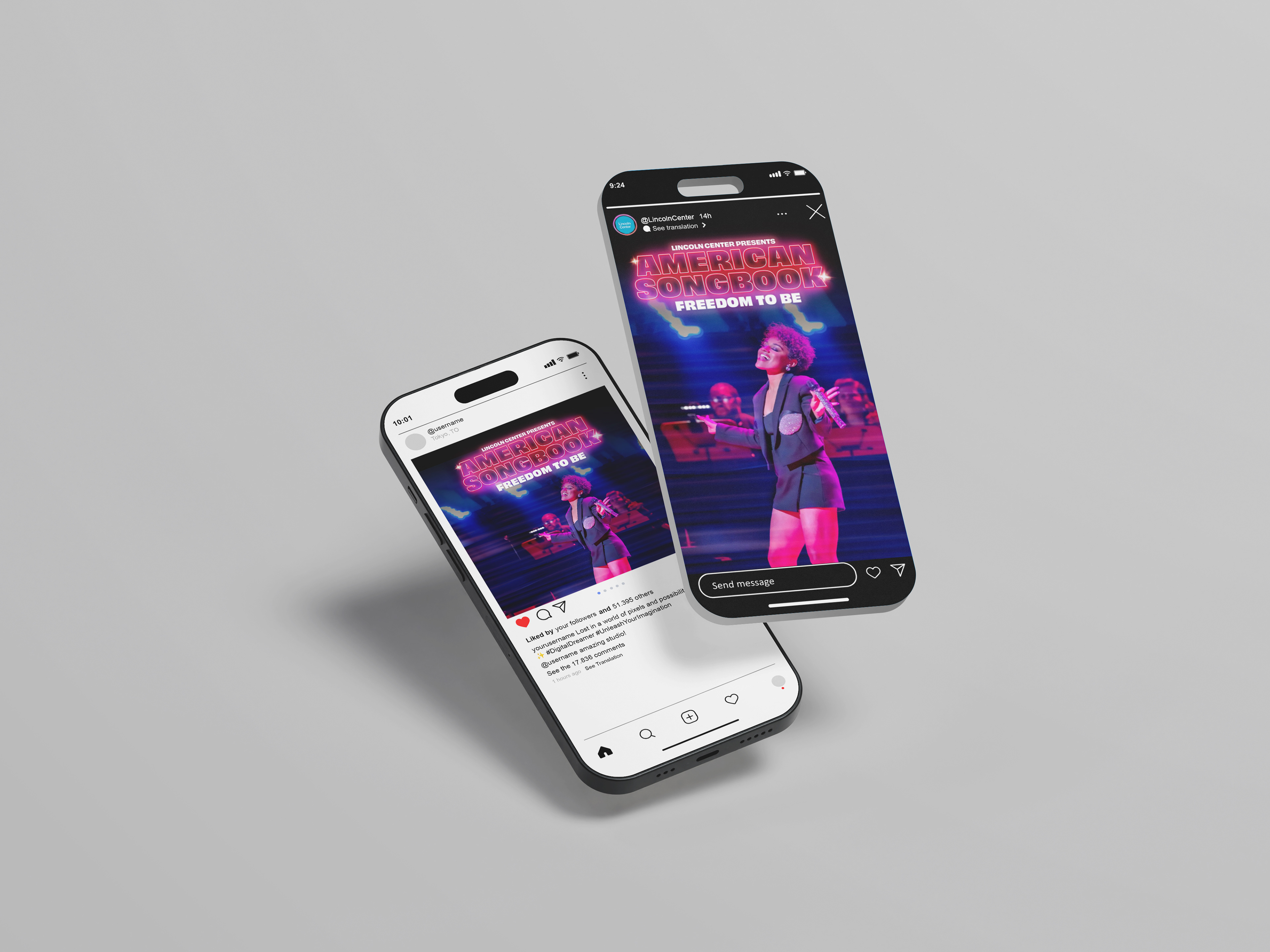
BRIEF:
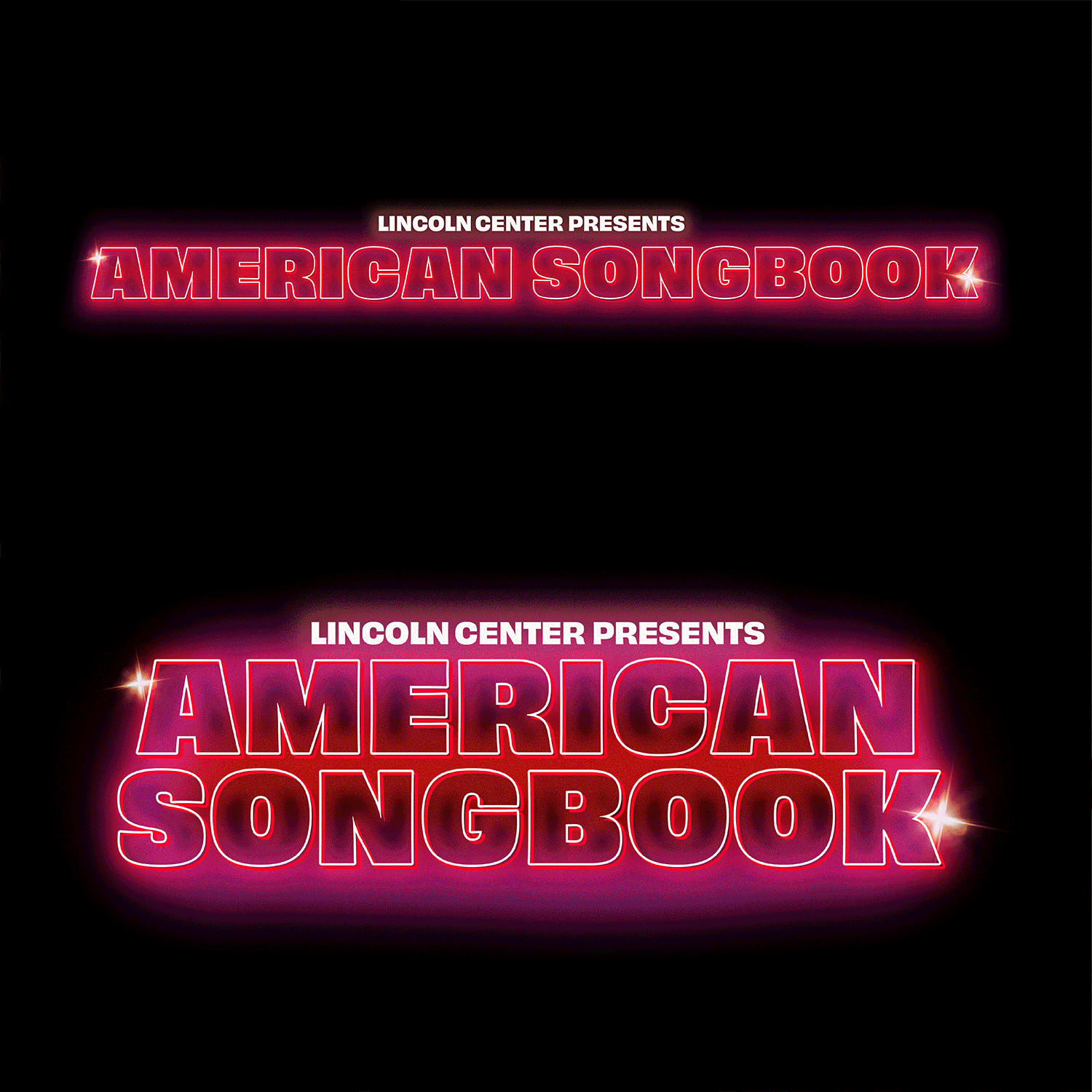
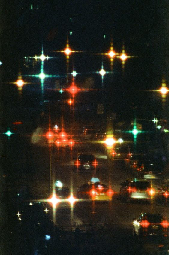
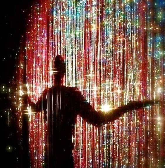
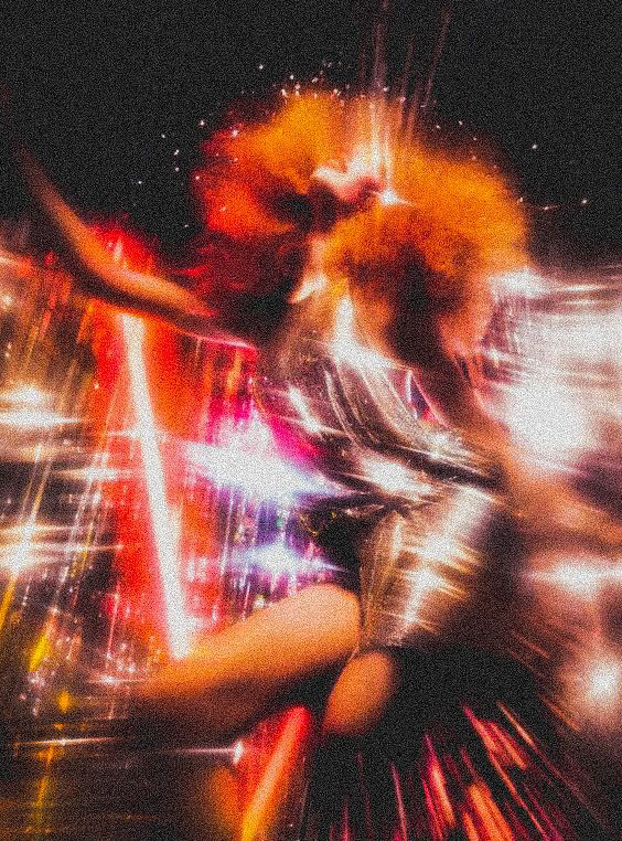
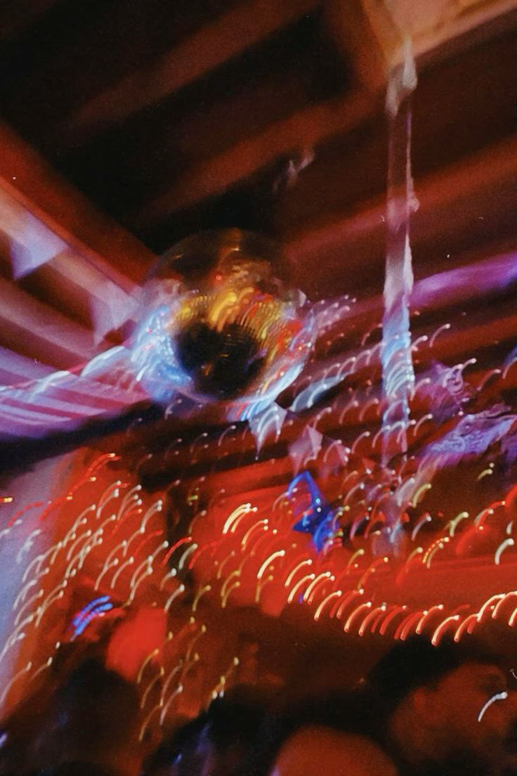
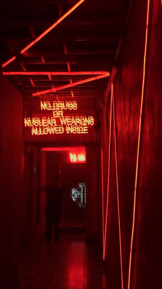
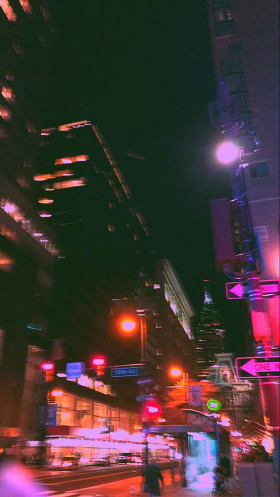
The only creative parameter was to use red as the main color, chosen to represent defiance and rebellion, a shift from the blue tones used in previous years. I also wanted red to be a nod to NYC nightlife, where there’s always a glowing red neon sign nearby, and you can walk into a random bar and catch a local performance.
ROLE:
Lead designer from start to finish, and this was an individual project. I was part of the in-house Lincoln Center design team.
TIMING:
This project took about 2–3 days, including feedback rounds.
CREDITS:
Art Director, Pat Morin.
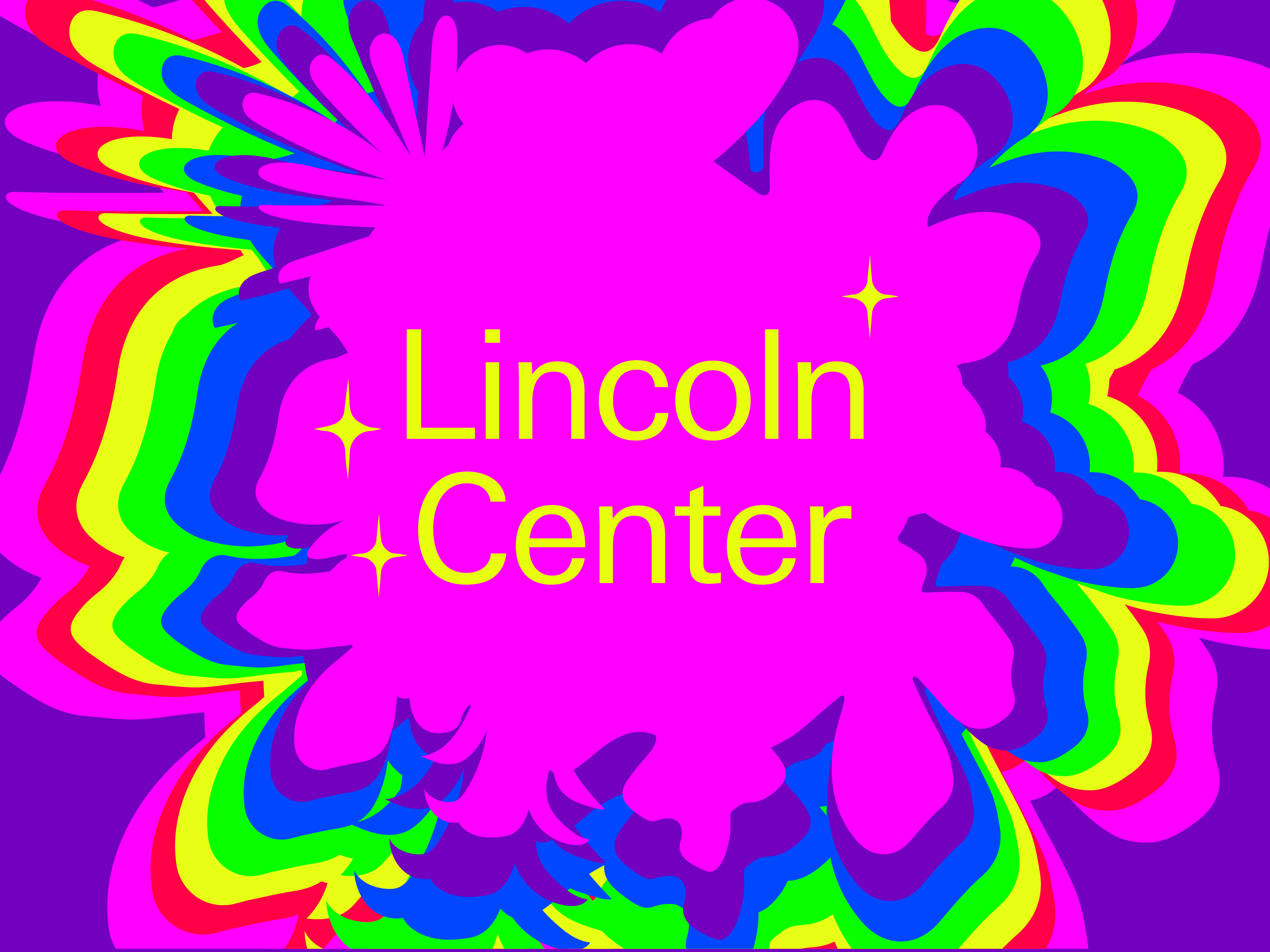
This was my mood board


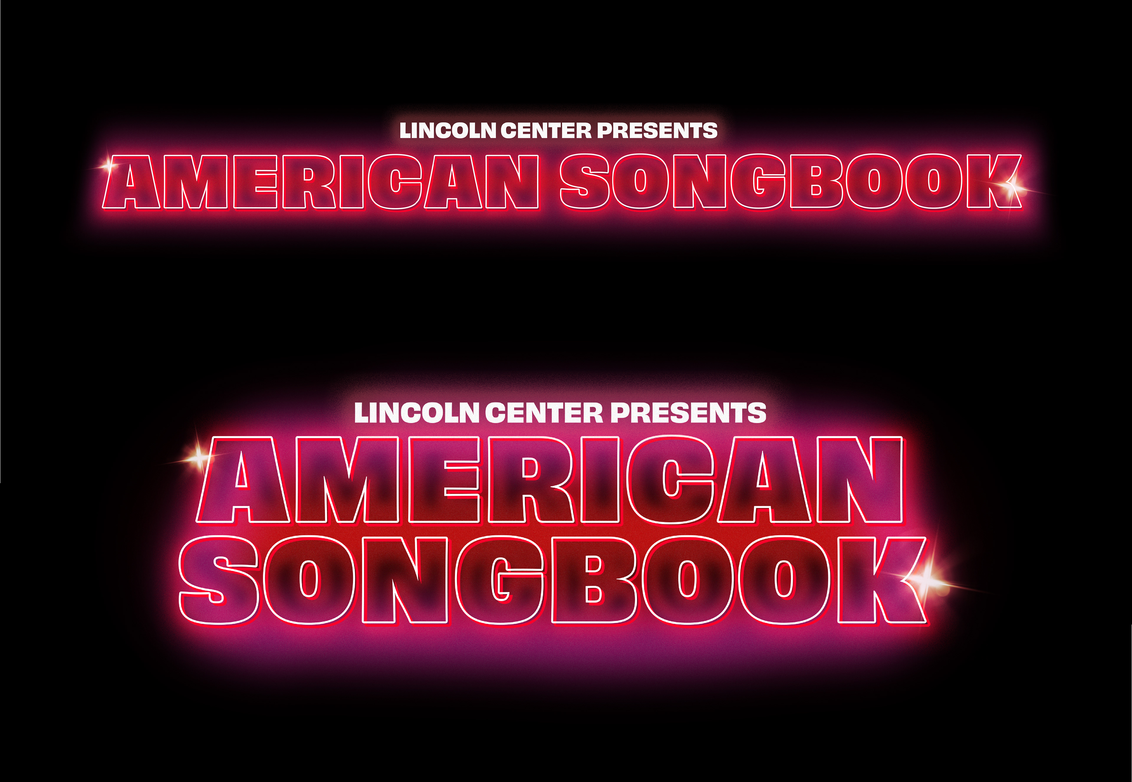
These were the final lock-ups
These are a few social media collateral pieces (not by me) using the look and feel I developed